Los Angeles-based creative agency for BIPOC businesses
Red Eye Creative is a Los Angeles-based marketing agency who helps black-owned, women-owned, and minority-owned businesses get visible both online and in real life. Founded by two Gen Z entrepreneurs, they are deeply tapped into culture and create stories that break the corporate rulebook.
What sets Red Eye Creative apart is their personal and hands-on approach to small business marketing. They aim to create a safe space where brands can share their stories while providing opportunities for BIPOC businesses to have a voice through social media campaigns and community events.
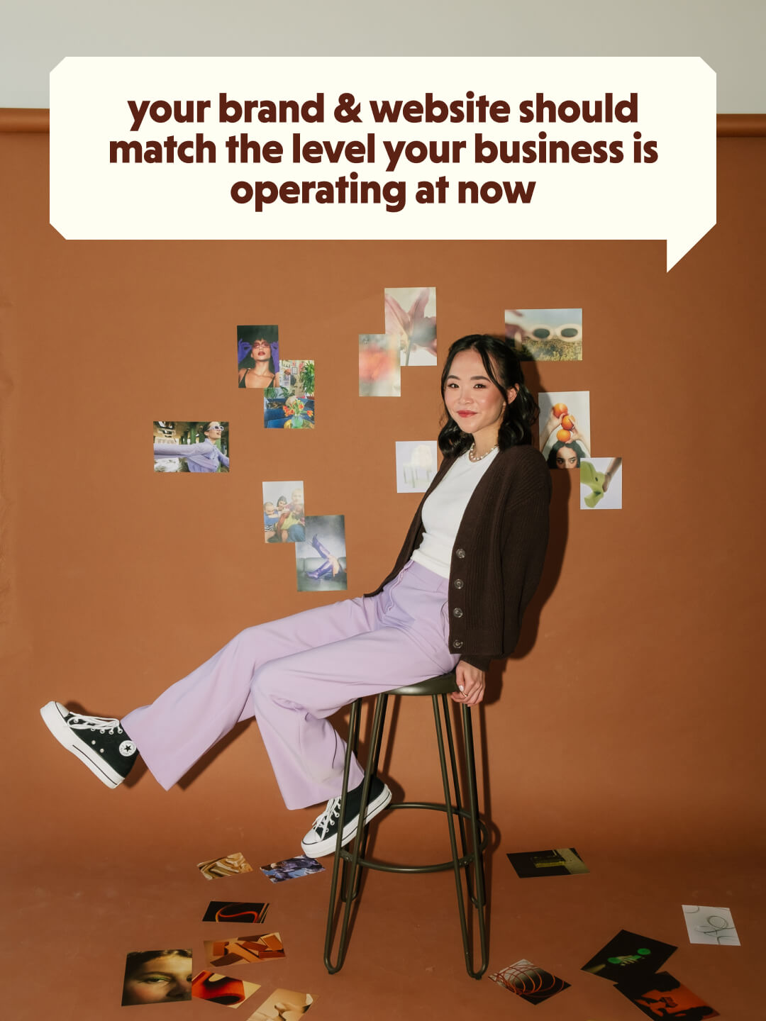
Our challenge was to design a bold and vibrant brand and website that reflects their playful personalities and rule-breaking spirit.
Brand Design
Brand Assets
Web Design & Development
2 months, split into two phases
2023
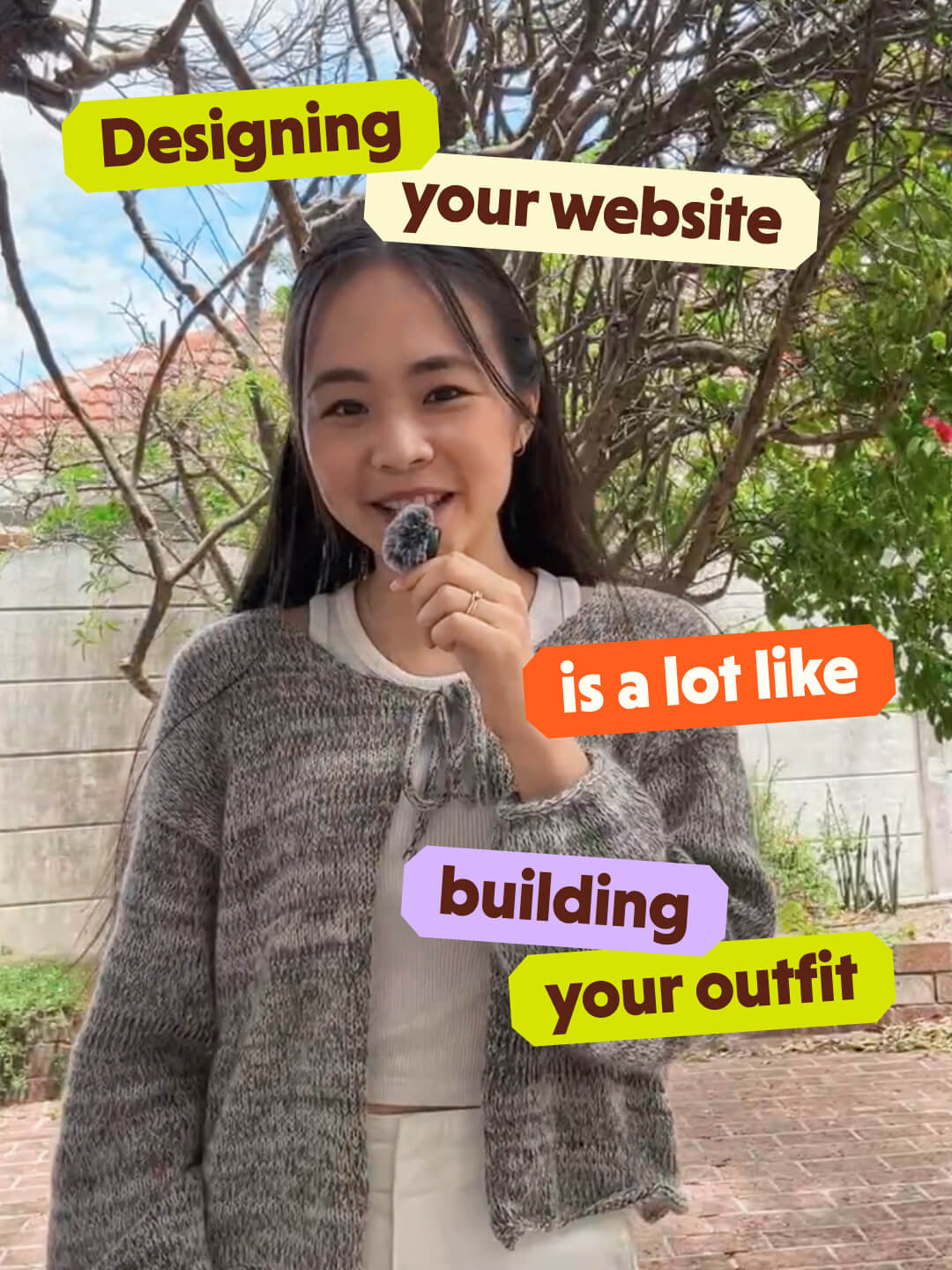
Out-of-the-box, yet approachable
When starting the brand design phase, I took a deep dive into Red Eye’s audience, competitors, and positioning to create a visual identity that truly stands out.
We identified Red Eye Creative’s brand archetype as a blend of The Regular Gal and The Rebel. The Regular Gal is approachable, down-to-earth, and thrives on building community, while The Rebel breaks the mold, challenges norms, and celebrates being different. Red Eye’s unique balance of hands-on marketing and innovative ideas perfectly embodies both archetypes.
Our research also revealed that most of Red Eye’s competitors leaned on a minimalistic, neutral, and basic brand identity. To differentiate Red Eye, we pushed towards a bold and edgy look with a hint of weirdness, creating a visual identity that is both out-of-the-box, yet still approachable.

The twinkle of an eye
We choose a bold and funky serif typeface for Red Eye Creative’s logo suite to create a distinct, standout look for their brand while differentiating them from competitors. The font features unique, organic swooshes in the letterforms, reflecting Red Eye’s fun and confident personality.
For the logomark, we customized the “R” to make it feel playful and instantly recognizable, even when used on it’s own.
To add a clever and creative touch, we included a sparkle element in the logo, alluding to the twinkle of an eye - a fun nod to their name. This playful detail highlights Red Eye’s wit and creativity, while symbolizing the “magic sauce” they bring to help brands thrive.
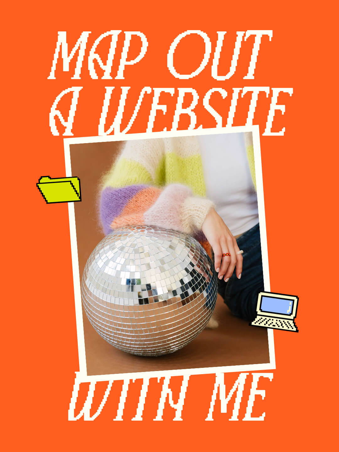
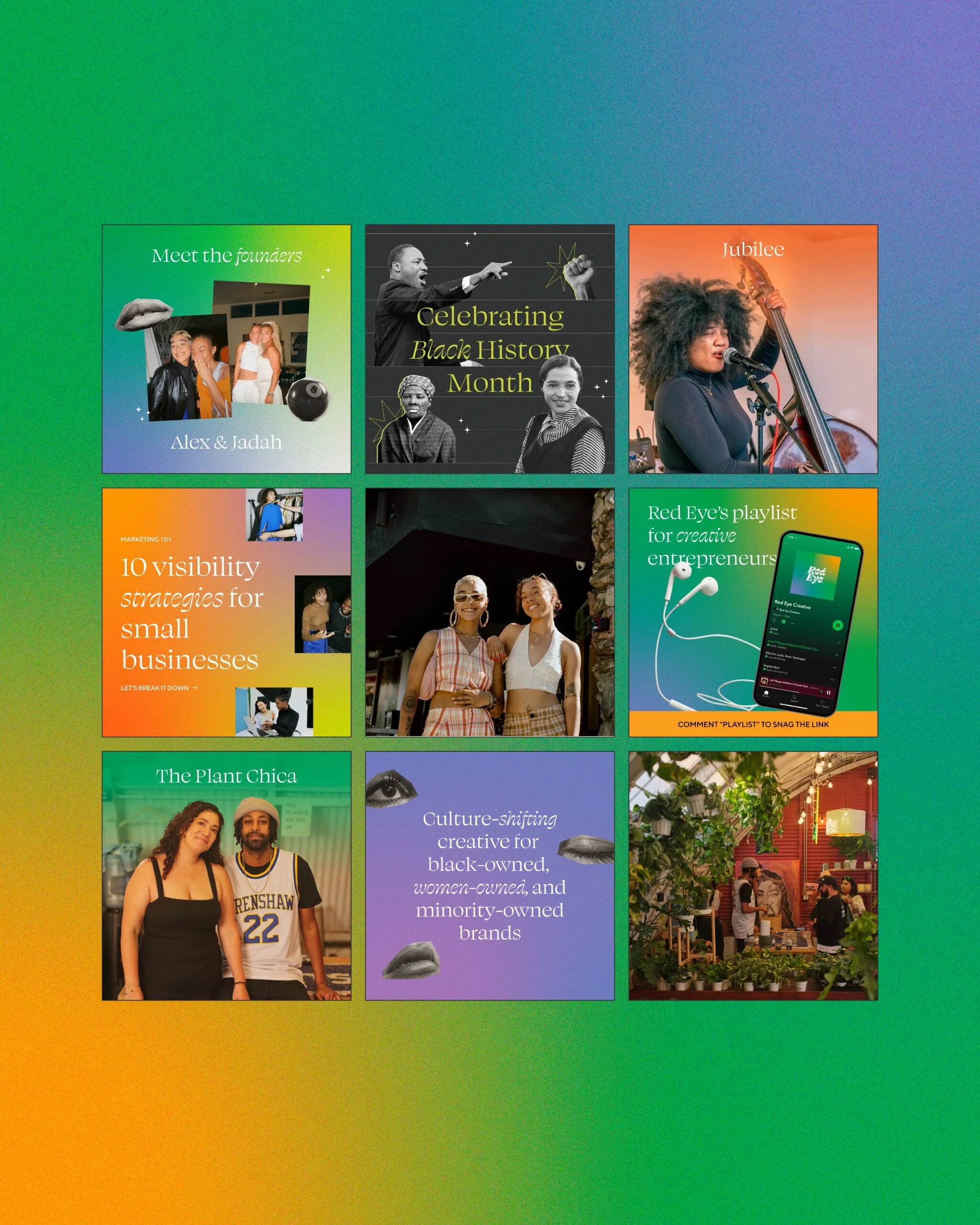
Funky cutouts with a hint of weird


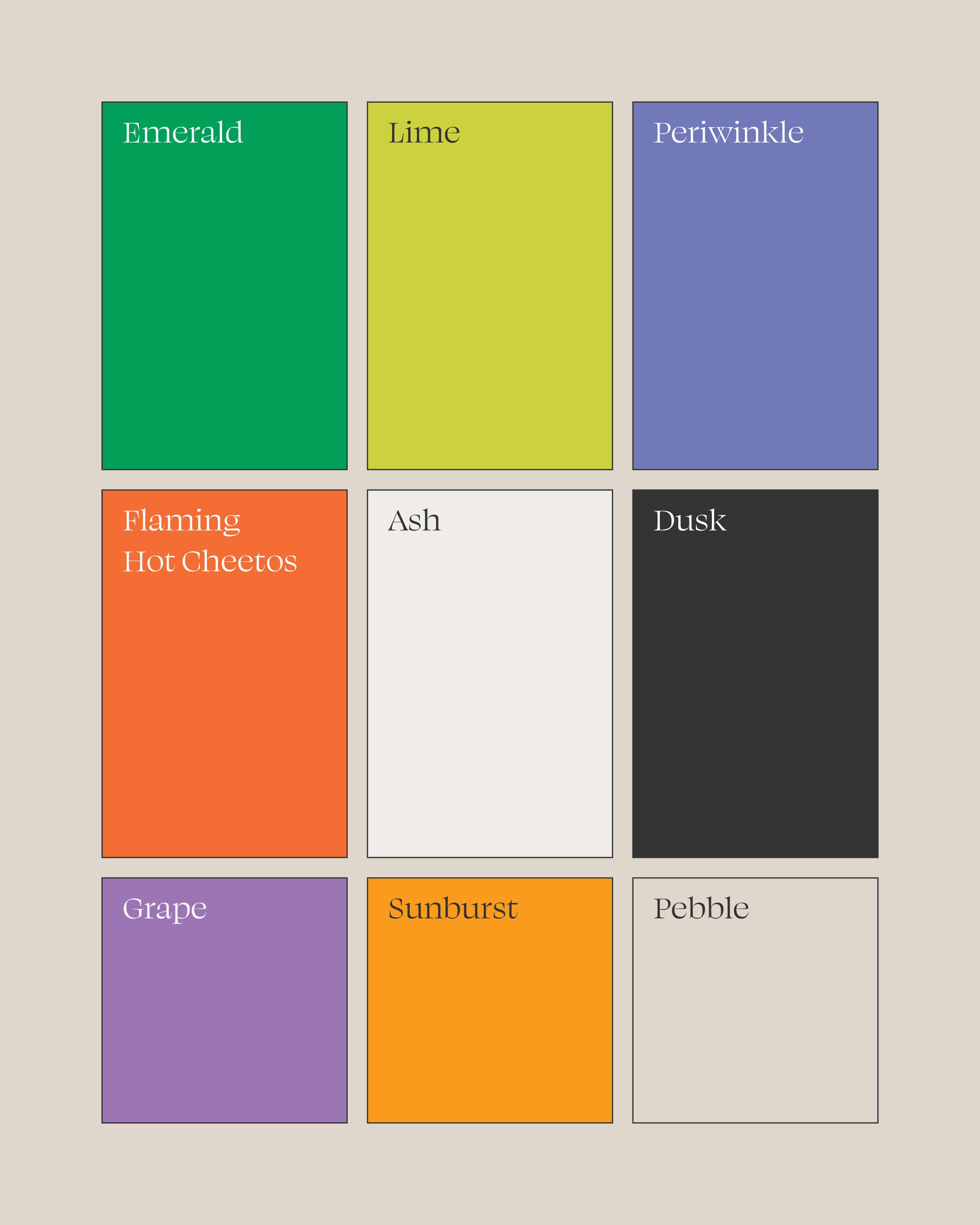
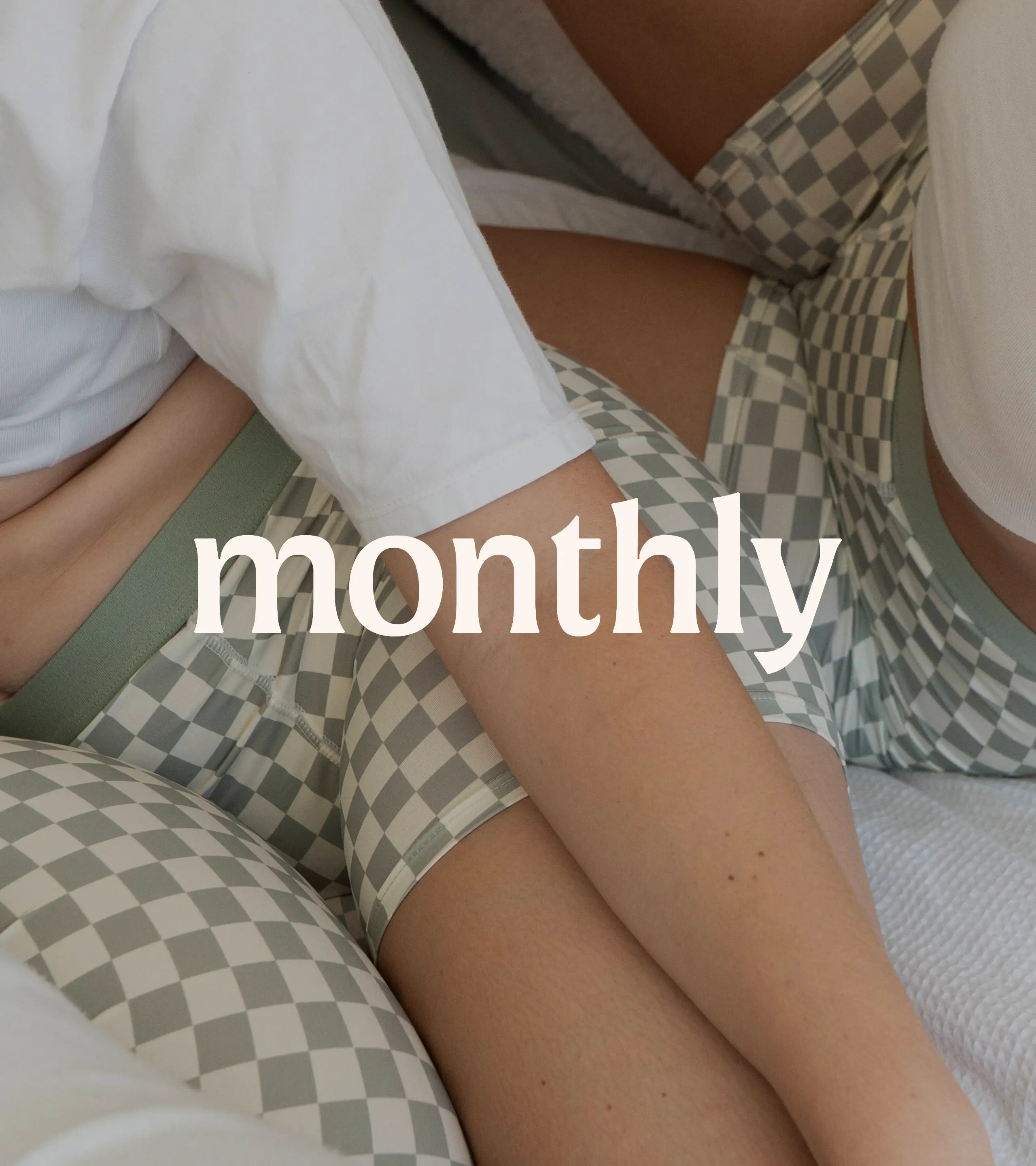
Ethereal and otherworldly color palette
I expanded on Red Eye’s previous colors of purples and greens to create a color palette that was vibrant and ethereal. Gradients and textures were added to bring depth and richness.
The founders wanted to avoid the color red (despite the name) and primary colors in general, so I focused on secondary shades like blood orange, lime green, and deep purples and greens. These colors symbolize passion, energy, and growth, aligning with Red Eye’s personality.


Playful and versatile pitch deck
I designed a customizable pitck deck template in Canva for Red Eye Creative, making it easy for them to showcase their social media work. While the layout remains relatively simple due to Canva’s design limitations, Red Eye’s vibrant visual identity keeps the presentation dynamic and engaging. The template includes a variety of layouts, giving Red Eye the flexibility to adapt and expand the deck as needed.

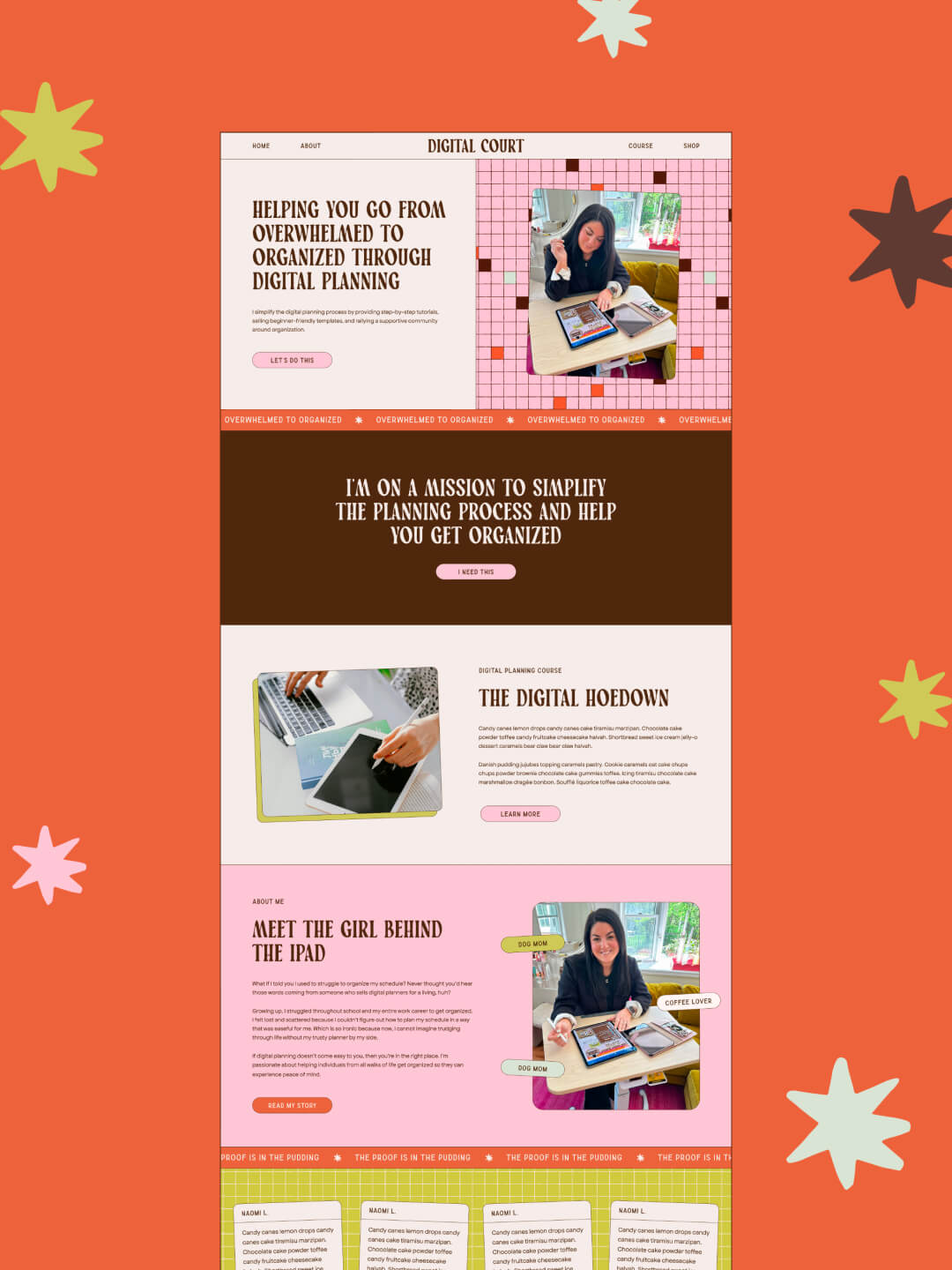
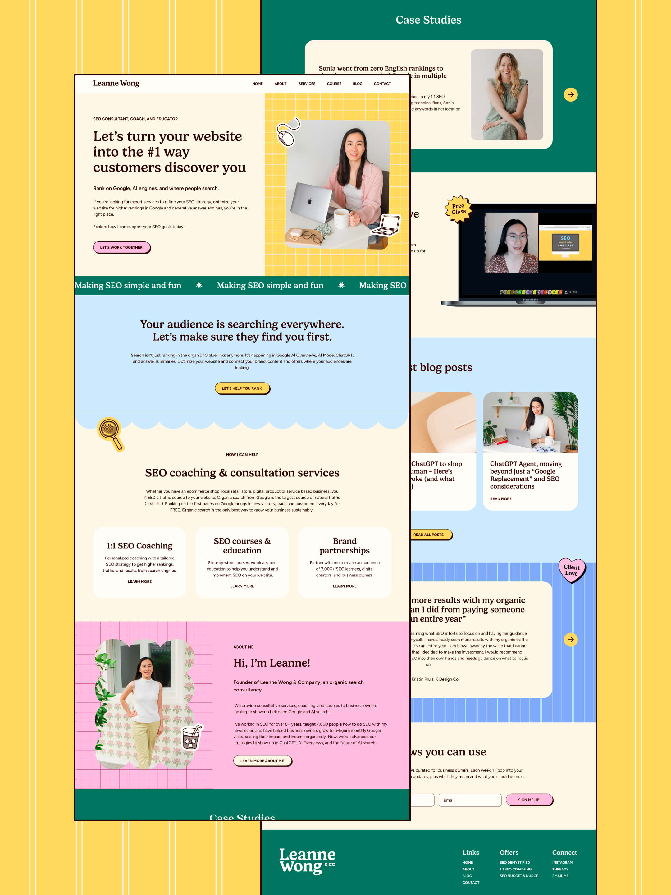
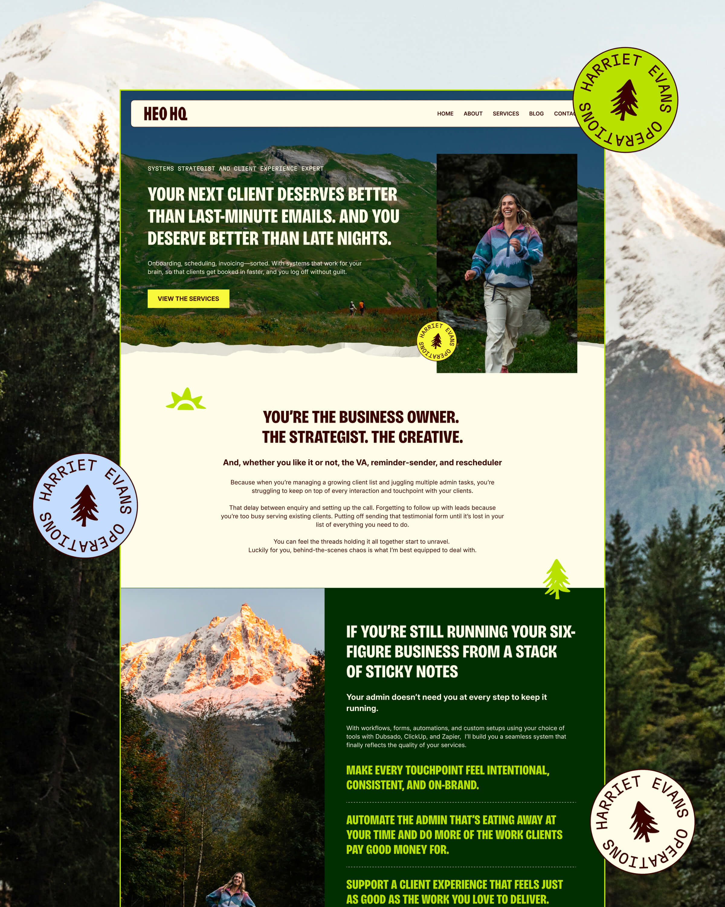
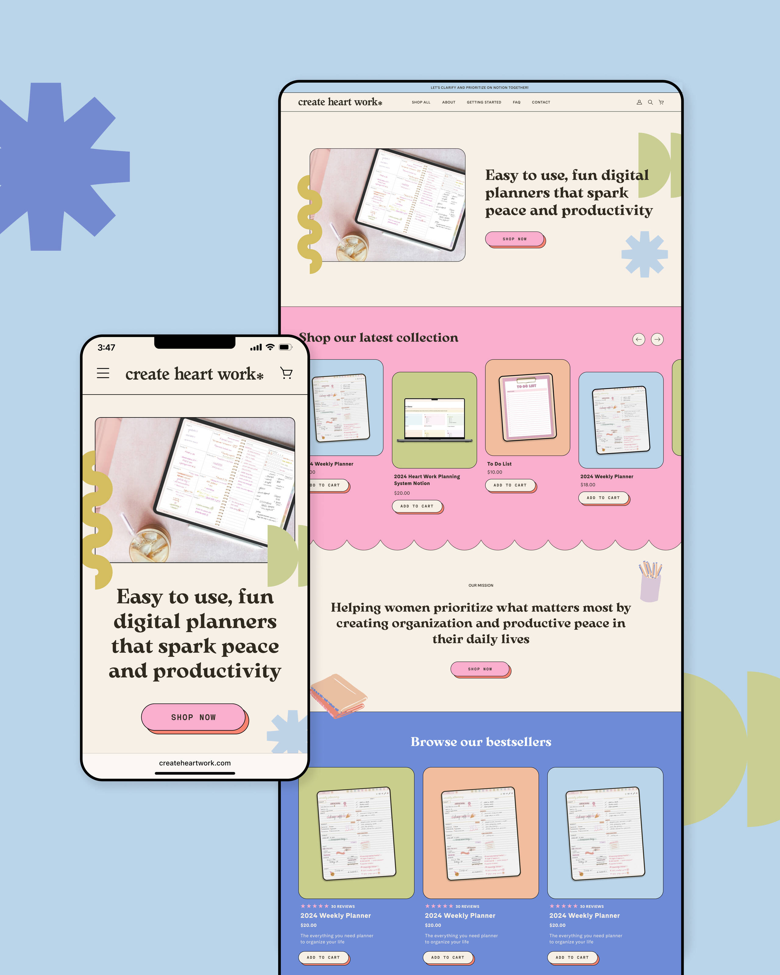
Sophisticated yet bold website
Creating Red Eye Creative’s website was the second phase of our project. While their brand as a whole was very playful, Red Eye wanted their website to feel more sophisticated.
To achieve this, we used more neutral backgrounds while strategically pulling in Red Eye’s brand colors in key sections. Because most of their competitors had neutral websites, we differentiated Red Eye by breaking this pattern and infusing bold pops of color throughout the site.
Red Eye only needed three key pages - Home, Case Studies, and Inquire - so we kept the layout straightforward and easy to navigate. Despite its simplicity, we introduced unique sections and interactive elements to keep the site engaging for their visitors.
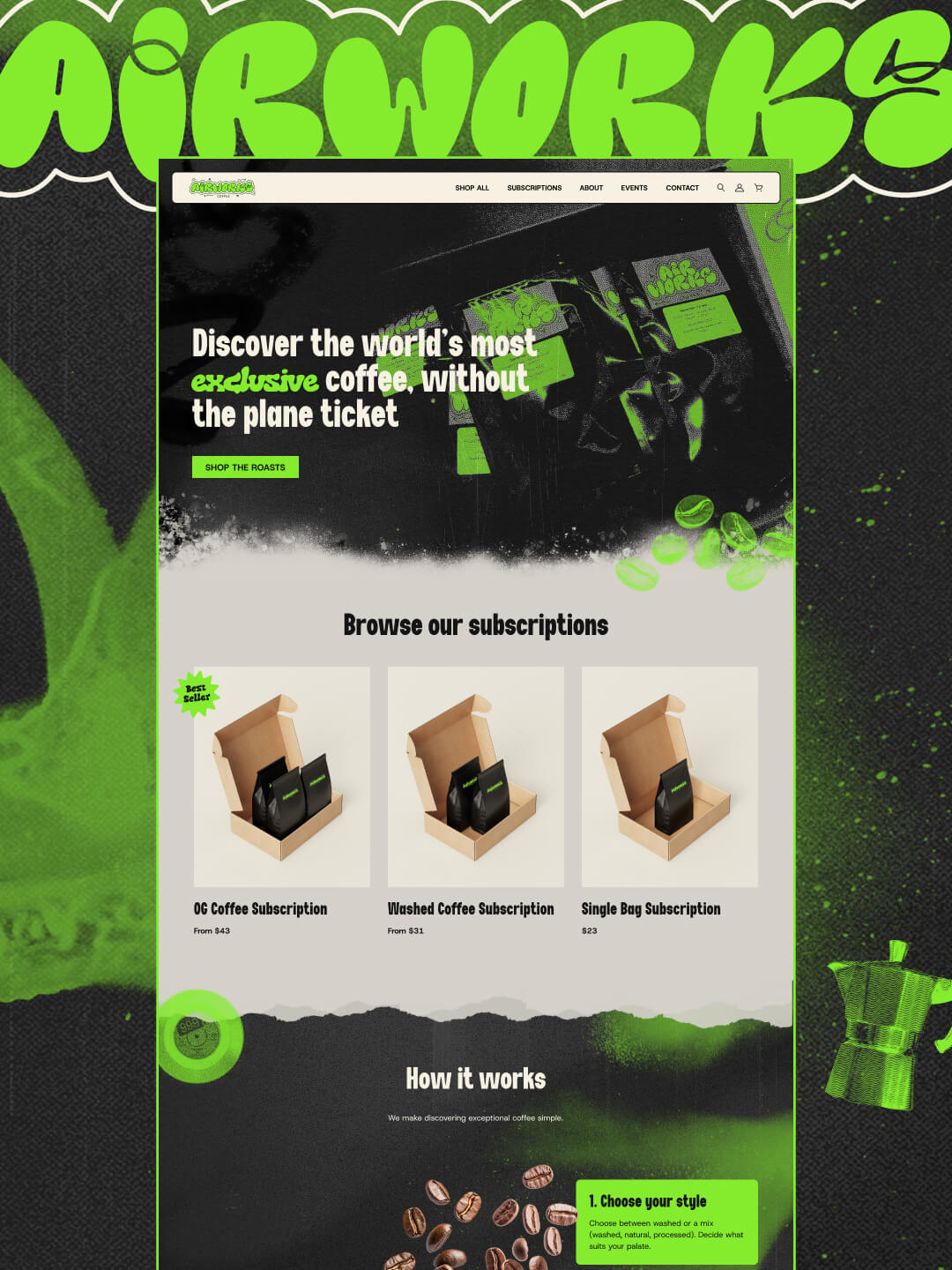

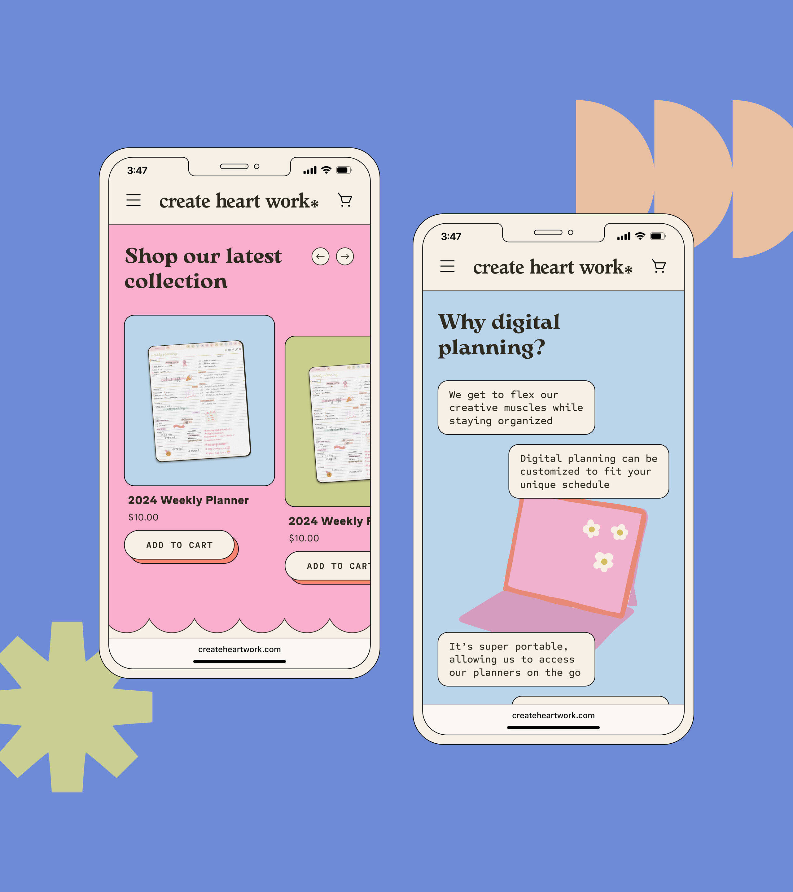
Adding in interactive elements


Hover below to scroll through the homepage
View the live site


"Olivia has been so great to work with! Her designs are fun and her understanding of our brand is SO thorough"
"We’ve worked with Olivia for our branding and website, and each time she’s been super in depth, helping my business partner and I gain a deeper insight into our look, feel, and audience. She's helped us define our brand and how we want to target our audience.
Having a place to send folks to and just being discoverable on the web is gonna be immensely helpful for us!"
—Jadah C, Red Eye Creative